Core Brand

Needle Brand System

Needle brand guide.

Identity

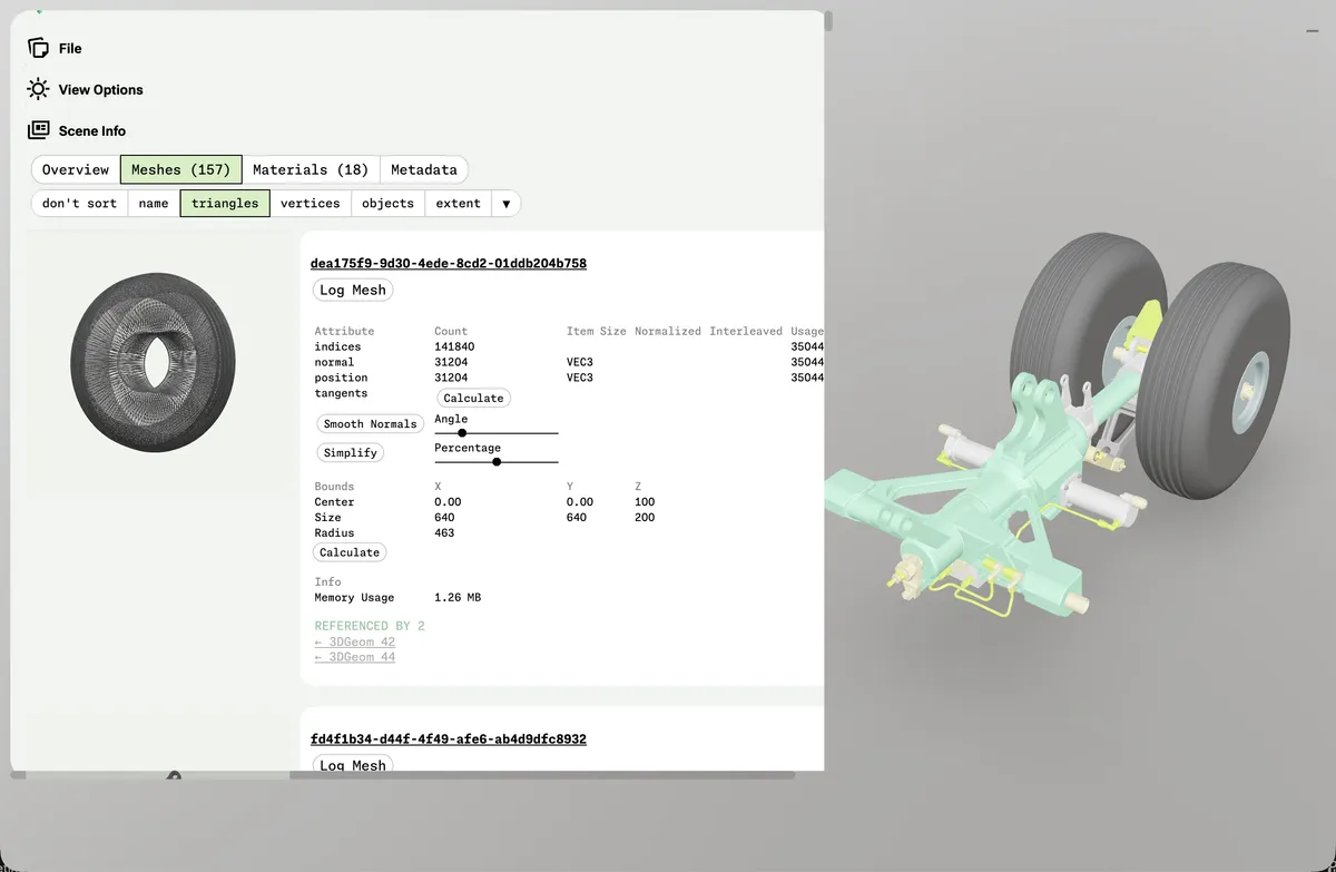
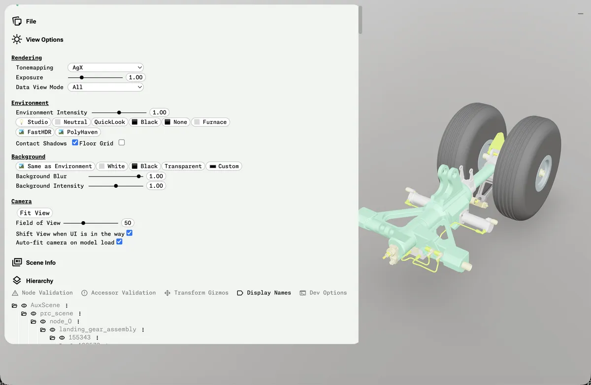
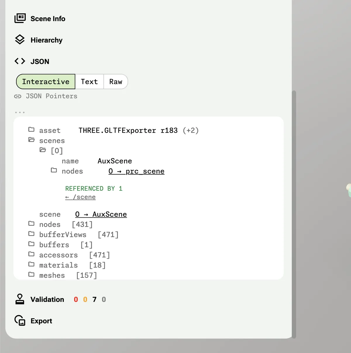
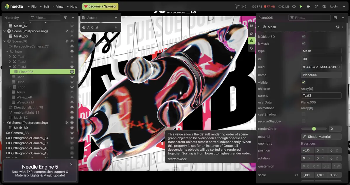
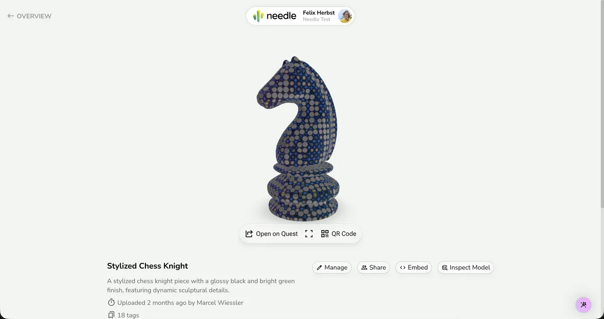
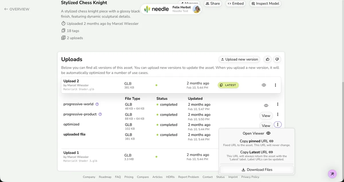
Use the approved logo assets. The viewer and inspector screenshots below show the target density and pane rhythm.

  • The Needle logo must not be edited, distorted, recolored, or reconfigured.
  • Maintain clear space around the lockup equal to roughly the height of the wordmark letter e.
  • Use the full lockup unless Needle is already clearly identified nearby.
  • Use black artwork on light surfaces and white artwork on dark surfaces with strong contrast.
  • The wordmark font treatment is reserved for the actual Needle lockup and should not be reused for ordinary UI text.
Color lockup — symbol + wordmark together
Primary brand mark for light surfaces. Use this as the default logo anywhere the Needle brand needs to appear.
lockupDownload
Black lockup — symbol + wordmark, single-color black
Monochrome variant for light surfaces when color is not available or appropriate.
lockupDownload
White lockup — symbol + wordmark, single-color white
Inverse variant for dark surfaces.
lockupDownload
Color symbol only — no wordmark, no surrounding padding
Use when space is constrained (favicons, app icons, avatar-sized spots) and the Needle name is already visible nearby.
symbolDownload
Black lockup without padding — symbol + wordmark, tight bounding box
For inline placement in headers, toolbars, or dense layouts where extra whitespace around the mark is undesirable.
lockupDownload
White lockup without padding — symbol + wordmark, tight bounding box
Inverse version of the tight lockup, for dark surfaces.
lockupDownload
Black wordmark — the word 'needle' in the brand typeface, no symbol
Rarely used alone. Only when the symbol is already visible separately and the name needs textual reinforcement.
wordmarkDownload
White wordmark — the word 'needle' in the brand typeface, no symbol
Inverse version of the wordmark, for dark surfaces.
wordmarkDownload
'Powered by Needle' badge, black
Attribution badge for third-party apps or scenes built with Needle Engine.
badgeDownload
'Powered by Needle' badge, white
Inverse attribution badge for dark surfaces.
badgeDownload
needle-icon-no-spacing-favicon.psd
Favicon source file (PSD)
Source artwork for generating favicon.ico at various sizes.
sourceDownload
Favicon (ICO)
Favicon (ICO)
Ready-to-use browser favicon. Place at the root of the deployed site and reference via <link rel="icon" href="favicon.ico" />.
symbolDownload
Viewer — compact split panes and small toolbar
Viewer — single dominant canvas with compact action row
Viewer — dense upload management inside one aligned surface
Viewer — dark stage with light technical chrome
Inspector — compact property editing and workflow density
Cloud — management page, not workbench
Cloud — compact list rows and inline actions
Needle Inspector — Launch Graphic

Colors

Needle uses a tight green-led palette with clear background, text, accent, and border colors.

Core Brand Colors

Accent Colors

Background Colors

Text Colors

Border Colors

Brand Gradient

Primary brand gradient for marketing flourishes, onboarding accents, and rare high-attention highlights. Avoid using this inside workbench stages, inspector panels, queue cards, export presets, or segmented controls.

Coral
linear-gradient(135deg, #FEAC8B 0%, #FE5A46 100%)
Charcoal
linear-gradient(90deg, #40393B 30%, #222125 100%)
Lavender
linear-gradient(90deg, #CAB3ED 30%, #DE6CDC 100%)
Teal
linear-gradient(90deg, #A6D4D4 30%, #688D9A 100%)
Green
linear-gradient(90deg, #9BDE8A 30%, #5CBD79 100%)
Sand
linear-gradient(90deg, #F6DDBB 30%, #F19931 100%)
Rose
linear-gradient(90deg, #FFB8B4 30%, #EF8E89 100%)

Typography

Typography roles for titles, labels, body copy, and code.

Hamburgevons 0123
Nunito Sans
Hero headlines, section titles, and the dominant UI typography.
displaybodyDownload
Hamburgevons 0123
Oblique
Reserved for the Needle lockup and wordmark artwork only.
wordmarkDownload
Hamburgevons 0123
IBM Plex Serif Italic
Occasional editorial accent or italic pull quote treatment.
accentSerifDownload
Hamburgevons 0123
Monaspace Neon
Inline code, code blocks, JSON/data views, and terminal-style technical output.

display

Hero titles, landing page feature names, and the strongest title moments.
Confident, rounded, compact, and highly legible.
Needle keeps technical interfaces calm and welcoming
Family: Nunito Sans

page-title

Primary title at the top of a docs page, marketing section, or a major standalone view. Do not use this as the default title size for everyday workbench tools.
Strong but calmer than display.
Needle keeps technical interfaces calm and welcoming
Family: Nunito Sans

section-title

Section headings and prominent content grouping labels.
Clear, friendly, and compact.
Needle keeps technical interfaces calm and welcoming
Family: Nunito Sans

tool-title

Compact titles inside product headers, toolbars, modal heads, and operational shells.
Direct, technical, and not promotional.
Needle keeps technical interfaces calm and welcoming
Family: Nunito Sans

panel-title

Inspector group titles, sidebar section headings, compact cards, and data panels.
Small, sturdy, and matter-of-fact.
Needle keeps technical interfaces calm and welcoming
Family: Nunito Sans

MICRO-LABEL

Overlines, metric captions, compact status labels, and inspector metadata.
Quiet, technical, and highly compact.
SELECTED MATERIAL
Family: Nunito Sans

metric

Numeric status readouts, compact KPIs, and operational summaries.
Readable, dense, and stable.
Needle keeps technical interfaces calm and welcoming
Family: Nunito Sans

body

Paragraphs, standard UI copy, and descriptive text.
Quiet, readable, and neutral.
Needle Engine lets you build rich 3D experiences for the web. Import your scene, add interactive components, and deploy to any platform — all from a familiar workflow. Lightweight, fast, and built on open standards like glTF and three.js.
Family: Nunito Sans

body-muted

Secondary explanation, timestamps, counts, and supporting metadata.
Softer than body but still crisp.
Needle keeps technical interfaces calm and welcoming
Family: Nunito Sans

label

Field labels, tabs, small buttons, and compact interface labels.
Firm and tidy.
Export settings
Family: Nunito Sans

code-inline

Inline code, identifiers, and short technical terms. Use em not rem so the size scales relative to surrounding body text and appears optically similar in height.
Clean, structured, and understated.
Use engine.load() to import a glTF scene at runtime
Family: Monaspace Neon

code-block

Larger code samples and dense technical information boxes.
Spacious, readable, and calm.
const scene = await engine.load('/city.glb');
Family: Monaspace Neon

Principles

Needle pages should stay calm, compact, and clear. Tools should feel like tools, not marketing pages.

Principles, page types, and anti-patternsShow the full guide.

Surfaces

  • Use a very light green page stage with white working surfaces.
  • Use solid surfaces in workbench UI.
  • Do not use blur, glass, or decorative gradients in normal panes or buttons.
  • Do not turn small facts into separate cards by default.
  • Keep the stage neutral or dark and let the content provide the texture.
  • Treat the stage as a working viewport, not a poster illustration.

Layout

  • Start from the primary task and surface, not from a preferred layout or hero header.
  • Fit the main workflow into the first viewport.
  • Use a stage only when the user is inspecting or manipulating a visual result.
  • A three-pane shell is common, not mandatory.
  • When a stage is present, keep it wider than the side panes.
  • Place controls close to the object they change.
  • Keep presets next to the settings or objects they affect.
  • Use tabs, drawers, or modals for secondary steps.
  • Use one shell before introducing nested cards.
  • Left and right panes should have different jobs. Do not mirror them.

Interaction

  • Reuse the core classes from brand.css before writing custom control CSS.
  • Segmented controls are one joined row of small segments with shared borders.
  • Keep segmented controls small and identical across header, stage, and inspector.
  • Slider rows are direct: label, value, then one real range input. No extra box.
  • Boolean rows are direct: label plus checkbox. No phone switch. No outer box.
  • Color-driven tools should expose real color inputs and direct hex values. Add one alpha slider row when opacity matters.
  • Tags are small, thin-bordered, and lightly tinted. No gradients.
  • Buttons in workbench UI are solid. Do not use gradients.
  • Use one small-control radius family per tool row. Do not mix multiple radii side by side.

Hierarchy & Trees

  • Tree views and nested lists use a consistent indentation rhythm so structure is scannable at a glance.
  • Rows stay content-height rather than oversized so trees remain dense and navigable.
  • Expand/collapse affordances (arrows or folder icons) sit to the left of the label. A single click toggles expansion; double-click or Enter activates.
  • Selection is shown with a subtle background fill (pale green or neutral tint), not a heavy border or color block.
  • Hover state is a lighter tint of the selection color. Keep the contrast low — just enough to confirm the pointer target.
  • Use connector lines or indentation guides only when they improve scanning. Keep them very light.

Information Density

  • Build the inspector as one continuous pane.
  • Use section dividers, alignment, and spacing instead of boxing every row.
  • Keep pane headers brief and singular.
  • Use tabs or modes instead of showing every surface at once.
  • Prefer compact rows and lists before larger cards or tiles.

Content Economy

  • Keep tool titles short.
  • In workbench headers, the tool name and current context read before the brand.
  • Pane headers should not restate their own role.
  • Helper text is short and local.
  • Long explanation belongs in docs, onboarding, help, or empty states.

marketing

Marketing pages are brighter and more playful, with floating pills, gradients, and larger type.

  • Keep the backdrop light and optimistic.
  • Use the brand or CTA gradient in focused, high-value moments only.
  • Let the lockup and call to action breathe inside large rounded panels or pill bars.
  • Use the header-pill plus footer-area shell for full marketing pages.

docs

Docs pages are quieter and more structured, on the same soft green stage with white content blocks.

  • Use one clear page title, then move into the content. Avoid marketing-style slogan stacks.
  • Use purple for link emphasis and navigation state more than bright green buttons.
  • Callouts are softly tinted green or blue on top of the pale page.
  • Code blocks are white and rounded, with restrained borders and plenty of internal padding.
  • Use the header-pill plus footer-area shell for full docs pages.
  • Footer links inherit the footer text color. Do not let browser-default violet show through.

management

Management pages are operational overviews and browsing surfaces. Use them for uploads, libraries, project lists, and cloud-style organization pages.

  • Use `header-pill` by default.
  • Keep one shared content width across the header, main sections, and footer inner content.
  • Prefer rows, tables, lists, and compact cards over a stage-first layout.
  • Use cards only where they group genuinely different content.
  • Footer is optional. Use `footer-area` only when the page ends like a website.

workbench

Workbench pages are hands-on product pages. Use them for focused tasks where the user is creating, editing, inspecting, or processing something.

  • Choose `header-tool` for dense operational pages. Use `header-pill` only if the page behaves more like browsing or management.
  • No hero.
  • Use the real Needle lockup when branding appears.
  • The tool name, file, or mode should read before the brand.
  • Decide the primary surface first.
  • Use a stage only when the result itself needs space.
  • If the task is mostly configuration or review, a two-column or single-pane layout may be better than a stage-first layout.
  • Group presets with the settings or objects they affect.
  • Add side panes only when they help the workflow. If both are present, they should have different jobs.
  • Reuse the same segmented control in the header, stage, and inspector.
  • Use direct property rows, check rows, and color rows inside the inspector.
  • Use a neutral or dark stage when the page needs a visual work surface.
  • Status is inline or optional. Do not add a KPI card row by default.
  • No blur, no glass, no marketing footer.

settings

Settings pages use white panels on green, clear labels, and compact spacing.

  • Use distinct white panels, but keep them compact and quiet.
  • Use tabs and segmented controls in the same compact viewer-style treatment used elsewhere in the product.
  • Keep only the active settings group in focus. Use tabs or sections to avoid overwhelming the user with everything at once.
  • Keep forms readable, direct, and factual rather than glossy or promotional.

data

Data-heavy and inspector views use mono details, white panels, and muted separators on a pale green stage.

  • Place structured data inside white rounded containers.
  • Use the Monaspace-style mono face selectively for identifiers, values, JSON structure, and technical labels.
  • Prefer light separators and spacing over dense grid lines.
  • Keep inspector rows compact and aligned. Avoid nested boxes around each field or duplicated summary panels.
  • Apply the data-ink ratio principle: remove any UI element that does not directly help the user read or compare values.

Anti-Patterns

  • Do not use a hero header in a workbench.
  • Do not use `header-pill` inside dense editors, inspectors, or technical panes.
  • Do not add a four-up KPI card row under the header by default.
  • Do not mirror the left and right sidebars.
  • Do not use gradients in normal panes, segmented controls, or workbench buttons.
  • Do not use multiple slider styles in one tool.
  • Do not mix multiple button radii in the same control row.
  • Do not box sliders, toggles, or small metrics in their own mini-cards.
  • Do not append a page-level footer strip to a workbench.
  • Do not redefine the core brand.css component classes.

Iconography

Use Material Symbols Rounded with the outline treatment in product UI. Use Lucide in marketing and docs.

  • Use one icon family per surface: Material Symbols Rounded for product UI, Lucide for marketing and docs.
  • Use Material Symbols Rounded in product UI. Use the outline treatment with variable font settings: opsz 20, wght 300–400, FILL 0, GRAD 0.
  • Use Lucide in marketing and docs.
  • Prefer outlined icons with rounded joins at around 20×20 optical size and 1.5–2px stroke weight.
  • Icons should feel secondary to text — use them to reinforce meaning, not replace labels. Icon-only buttons need a tooltip or accessible label.
  • Use a neutral text color for icons by default; tint with the brand green or purple only for active/selected state.
  • Keep the icon vocabulary small and consistent within a product: one icon per concept, reused everywhere that concept appears.
  • Mark icon elements with class='notranslate' and translate='no' so machine-translation services do not mangle icon ligatures.

Material Symbols Rounded

Material Symbols Rounded is the primary icon set for product interfaces — editors, viewers, and toolbars. The local product demos in this repo keep them in the outline treatment, so the examples here do the same. Icons are functional, never decorative — they clarify meaning beside labels, indicate state, and support hierarchy in trees and toolbars.

Navigation & Actions

Buttons and nav items pair a Rounded icon with a text label.

upload Uploadsettings Settingsshare Share

Status Indicators

Compact icons in muted tones communicate state without text.

check_circle Readywarning Warningerror Error

Tree & Hierarchy

Foldout chevrons, visibility toggles, and type indicators structure inspector trees.

expand_moreview_in_ar Scene
chevron_rightlightbulb DirectionalLight
expand_morevideocam MainCamera
deployed_code MeshRenderer

Inline & Contextual

Context menus and form controls use icons to reinforce affordance.

content_copydeletemore_vertvisibility

Lucide

Use Lucide for marketing pages and docs.

Navigation & Actions

Marketing buttons use Lucide icons with labels.

Download Open Docs

Status & Feedback

Inline status uses Lucide icons at matching text scale.

Ready Warning Error

Documentation

Docs surfaces use Lucide for callout, navigation, and content icons.

Docs Tip API

Utility

Small utility icons for copy, share, and contextual actions.

Component Playground

Main Needle UI patterns.

Product Shells

Technical Controls

Management & Data

Marketing & Docs

Terminal

Needle
Asset Optimizerwarehouse_master.glb / progressive-product
Ready
orbit • fit • isolate warnings
LOD Preview
BuildUse the compact workbench shell when the page needs one dominant work surface. Reuse `.workbench-shell`, `.header-tool`, `.workbench-grid`, `.stage`, `.pane`, and `.segmented-control` from brand.css. Status strip is optional. Choose the arrangement from the task: stage plus inspector, two-column result plus settings, or one continuous inspector are all valid. Add panes only when they help. Use a stage only when the result needs space. Keep controls close to the thing they change. Do not mirror the sidebars. Do not add KPI cards under the header. Keep panes and buttons solid.
Needle
Asset Optimizerwarehouse_master.glb / progressive-product
Ready
BuildUse this for dense product tools. Reuse `.header-tool`, `.header-tool-leading`, `.header-tool-title-group`, `.header-tool-actions`, `.header-tool-status`, and `.header-tool-button` from brand.css. Keep it top-aligned, compact, and on the page background. Put the real lockup on the left. Put the tool name and one short context line next to it. Keep modes and actions in the same row. No eyebrow. No long subtitle. No blur. No glass.
selectionwarehouse_master.glbtriangles1.8M → 1.1Mtextures18 → 9 atlasesstatusqueued for export
BuildUse a status strip only when the header or stage footer cannot carry the facts. Keep it to one slim row. Use compact labels and values. Do not turn it into a KPI card deck.
Recent
Assets
BuildIf a Needle tool offers quick command, present it as a compact command palette dialog above the current workflow. Use one strong modal container, a short search field, grouped action rows, and quiet keyboard hints. Do not turn quick command into a permanent marketing card or a large decorative panel inside the page.
viewer modes
inspector scope
BuildReuse the `.segmented-control` class from brand.css. Build one joined row of small segments with visible vertical dividers. Short labels only. Selected segment is pale green with the darker outline. Do not add outer padding, chip gaps, shadows, or oversized pills.
Light Balance
63%
28%
34%
BuildBuild one direct row: label, value, then one real `input[type='range']`. Reuse `.property-row` and `.property-row-head` from brand.css. Do not box the slider.
Lighting Color
BuildFor color-driven tools, expose a direct one-line color row. Reuse `.color-row`, `.color-field`, `.color-field-button`, `.color-popover`, and `.color-input` from brand.css. Put detailed color and alpha controls inside the popover, not as extra permanent rows.
Transmission
1.52
0.04
normal mapnormal_2k.ktx2
BuildBuild one continuous inspector pane. Use one short pane title. Then use direct property rows, check rows, and color rows. Keep helper text local. Do not turn each control into its own card. Do not duplicate the left pane.
compressiondraco + webp
lod bakingenabled
mesh mergeby material
publish targetcloud / staging
BuildFor settings UIs, start with a pastel green page background and place white rounded panels on top. Use compact viewer-style segmented controls and soft selected states instead of aggressive color blocking. Keep headings compact, align control rows, and move explanations close to the relevant control instead of writing long introductory paragraphs.
BuildUse a white floating dropdown with rounded corners, soft border, and stacked rows. Optional leading icons are good. Use separators between groups. Keep the menu calm and readable, not dark or glassy.
BuildUse `.user-profile` for Cloud-style account identity: real Needle lockup, two-line person/workspace text, and one circular avatar on the right. Use `.user-profile-card` when the profile needs account facts or menu actions. Keep it compact, white, rounded, and lightly bordered. Do not turn the profile into a hero, and do not replace the Needle logo with initials.
/nodes/12/materials/0
mesh_12
selected material
KHR_texture_transform
generatorKhronos glTF Blender I/O v4.3.47
scene0 → convert
materials[0].nameMaterial.001
specularColorFactor2 2 2
referenced bypart_0, part_1, part_10, part_11
BuildFor JSON or object inspection, use the pale green page stage with one dominant white content panel. Add compact viewer-style segmented tabs for view modes, set data in Monaspace-style mono, and keep tree structure readable with soft separators and light green active states. Do not add extra summary cards above the main panel unless they reveal genuinely distinct information.
Stylized Chess Knight

Stylized Chess Knight

2 uploads · 18 tags · updated 2 months ago
latestinspectshare
VersionTypeStatusUpdated
Upload 2GLBLatest2 months ago
progressive-worldGLBCompleted2 months ago
optimizedGLBCompleted2 months ago
BuildUse this recipe for management and browsing pages, not for workbench tools. Keep the stage pale green and let white rows, cards, or list surfaces organize the content. One larger focal card can anchor the layout, with supporting rows or cards around it. Avoid invented decorative gradients inside thumbnails or preview areas unless the asset itself provides the visual.

MaterialXDemos

Uploaded 1 day ago by Felix Herbst
tags10uploads6ready

Status Tags

rootbatch rootsource handlemarked root
latestmainownermemberversions12

Tags stay tidy and compact; they support structure instead of stealing focus.

BuildUse a white rounded card with a soft border and very gentle elevation. Keep the interior clean and readable rather than glossy. In workbench layouts, use cards sparingly; do not turn every control group, toggle cluster, or small metric into its own large card.
BuildBuild a floating white pill header for marketing, docs, cloud overviews, and lighter management surfaces. Reuse `.header-pill-shell`, `.header-pill`, `.header-pill-brand`, `.header-pill-nav`, `.header-pill-actions`, and `.header-pill-dropdown` from brand.css. Keep the real lockup on the left, navigation in the middle, and actions on the right. If the page needs a page or product name, use plain text next to the lockup, not a fake wordmark. Keep one shared content width across the page and let the menu collapse into an overflow panel on narrow widths. Do not use backdrop blur. Do not use this inside dense operational pages.
BuildUse a calm multi-column footer on marketing, docs, and website-like management pages. Reuse `.footer-area` from brand.css. The footer spans the full page width; constrain inner content inside `.footer-area-main`. Keep it open on the page stage: no boxed panel, no tinted footer slab, no violet links. Do not append it to dense operational pages.
TIP
Start with Getting Started to install and set up your environment first.
WARNING
This API is experimental and may change in future releases. Use with caution in production.
BuildFor docs callouts, use a softly tinted green or blue panel on the pale page. Keep the edges rounded and the tone friendly rather than urgent.
void MyCallerMethod() {
  var position = new Vector3(0, 0, 0);
  MyExampleVectorMethod(position);
  Debug.Log("Position.x is " + position.x); // copy was modified
}
BuildPlace code inside a white rounded panel with soft border and lots of padding. Use mono typography, muted supporting comments, and avoid dark-theme heaviness by default.
klaudioNeedle-flavored command flow
Choose an action
Generate branding page output
Open remotion palette scene
Inspect package previews
$ needle branding --target static --preview json
Generated 8 artifacts in tests/output
needle buildVite plugin output
[needle:asap]watching for changes...
[needle:logger]Build started
[needle-copyfiles]12 files, 4.2 MB
[needle-buildinfo]version 3.49.2-beta
[needle-defines]NEEDLE_ENGINE_META
[needle:ai]WARN: experimental feature enabled
[needle-buildpipeline]✓ Build complete in 820ms
BuildFor terminal UI, use a dark rounded shell with Monaspace-style mono text, calm dim secondary lines, and Needle green only for the active prompt, selected row, or success state. It should feel like a technical tool made by Needle, not a hacker movie terminal.

Accessibility

Rules for focus, motion, contrast, and translation.

keyboardFocus & Keyboard

Every interactive element must show a visible :focus-visible ring. The standard ring is 2px solid var(--border-focus) with outline-offset: 2px. Never remove outlines without providing an equivalent indicator.

Link focus

motion_photos_pauseReduced Motion

When prefers-reduced-motion: reduce is active, all transitions and animations collapse to near-zero duration. Smooth scrolling reverts to instant jumps. Essential state changes (like checkbox ticks) remain visible — only decorative motion is removed.

@media (prefers-reduced-motion: reduce) {
  *, *::before, *::after {
    animation-duration: 0.01ms;
    transition-duration: 0.01ms;
    scroll-behavior: auto;
  }
}

contrastHigh Contrast

prefers-contrast: more strengthens borders, removes decorative shadows, and ensures minimum text contrast. forced-colors: active (Windows High Contrast Mode) lets the OS palette govern all foreground and background colors.

@media (prefers-contrast: more) {
  :root {
    --border-subtle: #666;
    --shadow-subtle: none;
  }
}
@media (forced-colors: active) {
  button { border: 1px solid ButtonText; }
}

translatenotranslate

Machine-translation services (Google Translate, DeepL) will mangle Material Symbols ligature text — e.g. close becomes cerrar. Protect icon elements with class="notranslate" and translate="no". Use this on icon spans and brand-specific terms.

<span class="material-icon-preview"
      translate="no"
      class="notranslate">
  settings
</span>